
Sole Product Designer | Responsive Web
Context
Carvana transformed the car buying landscape with its straightforward and seamless digital experience. It grew fast and inevitably experienced growing pains such as outdated designs. Before I joined the company, my team had already completed a redesign of the checkout flow. Although these new designs were visually appealing and aligned with our brand, they negatively impacted conversions on our Financing page. It was a setback that we couldn’t understand and so I was tasked to figure out the problem and create a solution that’d recuperate our conversion rate.
Challenge
The legacy Financing page was functional but visually outdated and confusing. During the redesign, my team introduced more trade-in details, an easier way to customize terms, and provided two financing term choices instead of one. While these changes seemed logical, they inadvertently introduced multiple discrepancies, making it difficult to identify the exact cause of the decrease in customer conversions.
Objectives
Business
Regain the lost conversion by reducing confusion and increasing customer confidence in their financing terms and payments.
User
Clarify financing terms for users and explain the impact of trade-ins on their down and monthly payments.
NAVIGATE
Unraveling the Mystery:
How the Two Versions Differed
First thing I did was to analyze the two versions and audit all the differences. The exercise was necessary to fully understand the problem and dig deeper into each discrepancies to come up with a hypothesis to validate.
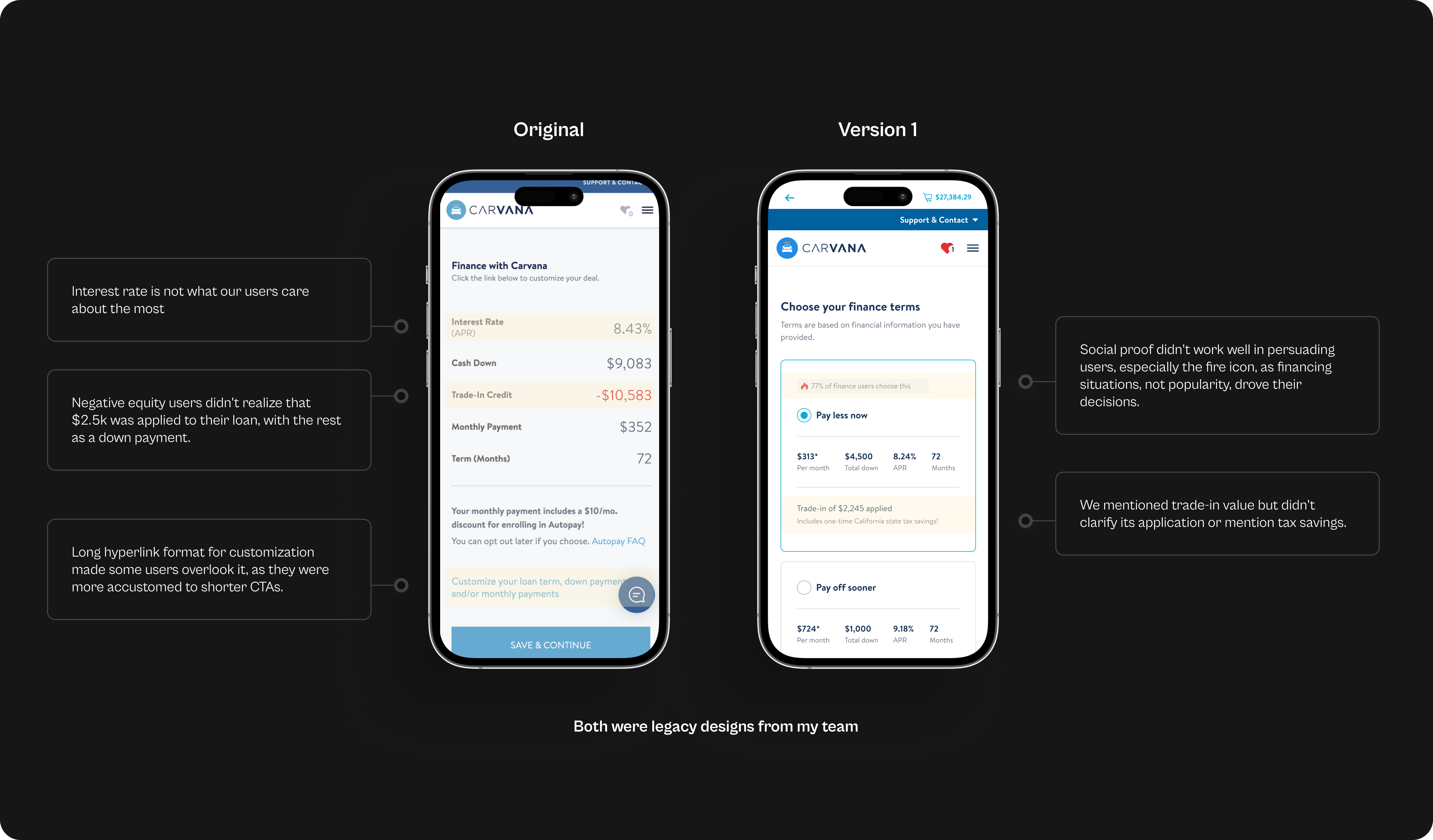
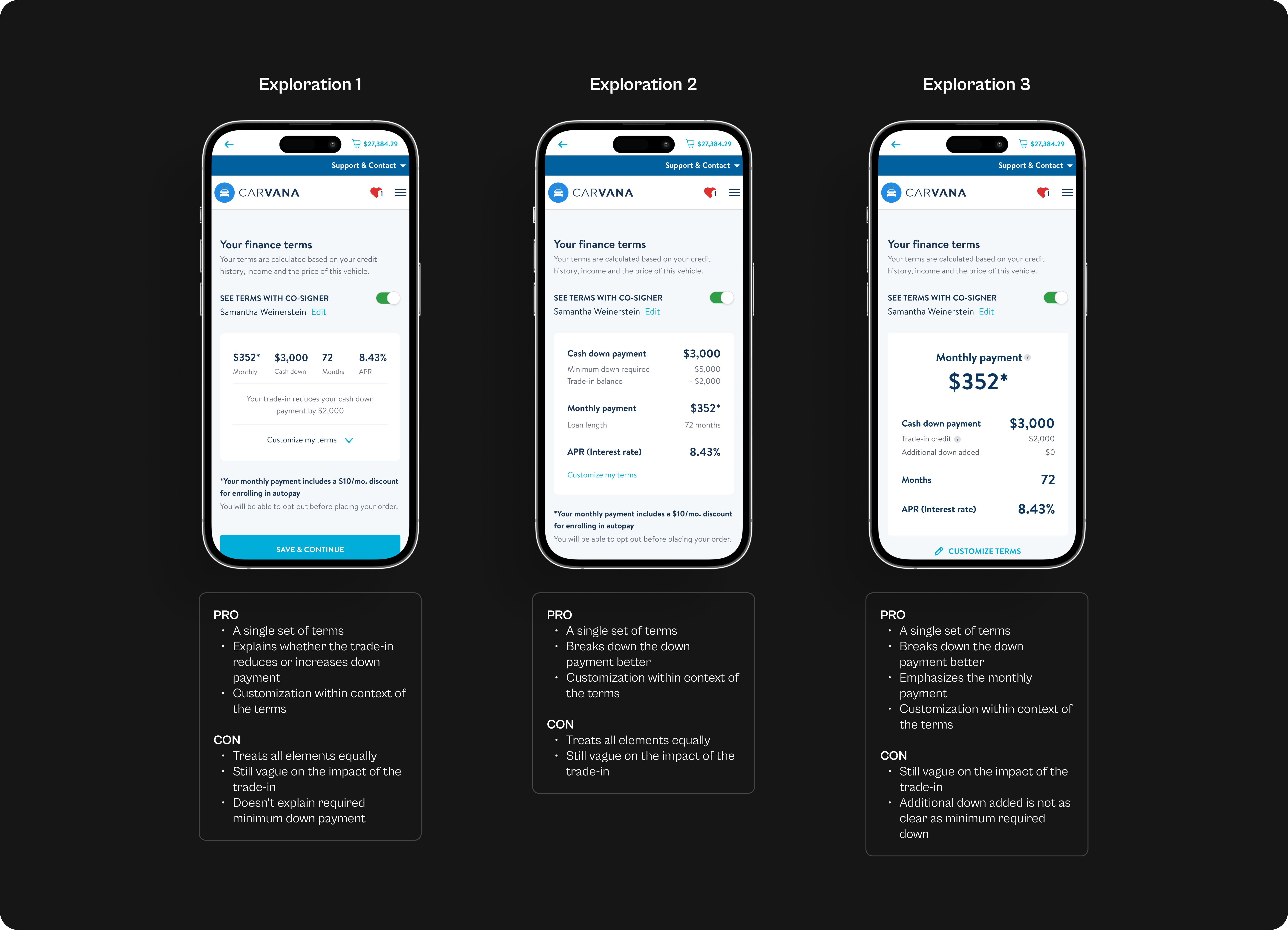
First difference that stood out to me was that we were offering two sets of financial terms instead of just one. This didn’t align with existing mental models of how financing terms are usually presented. Typically you would input your financial information and the lender would spit out one term that you either accepted or declined.
Instead, we forced users to pause and choose between different financial terms, creating unnecessary stress and difficulty, especially for those with sub-prime credit scores who have limited financial flexibility.
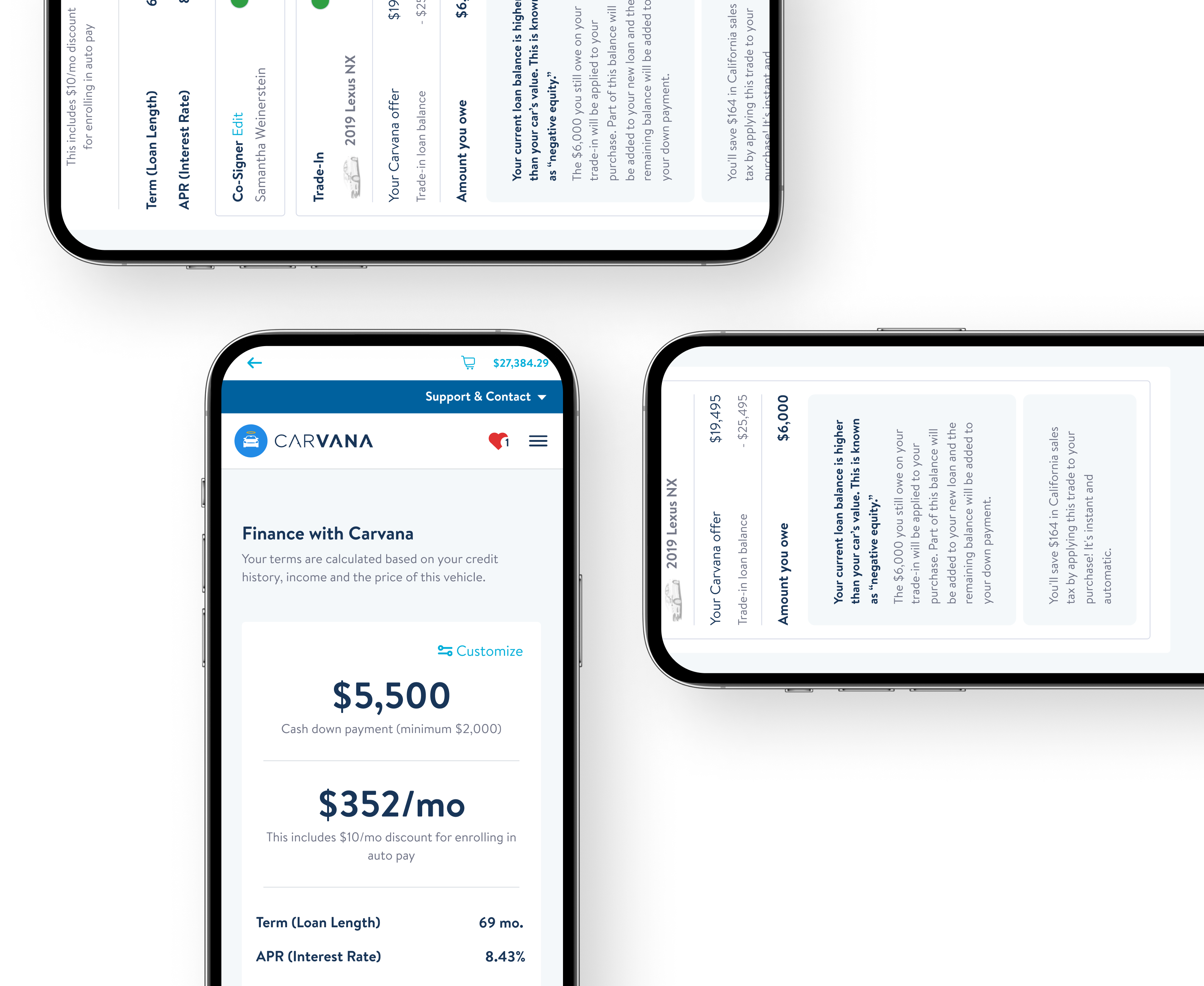
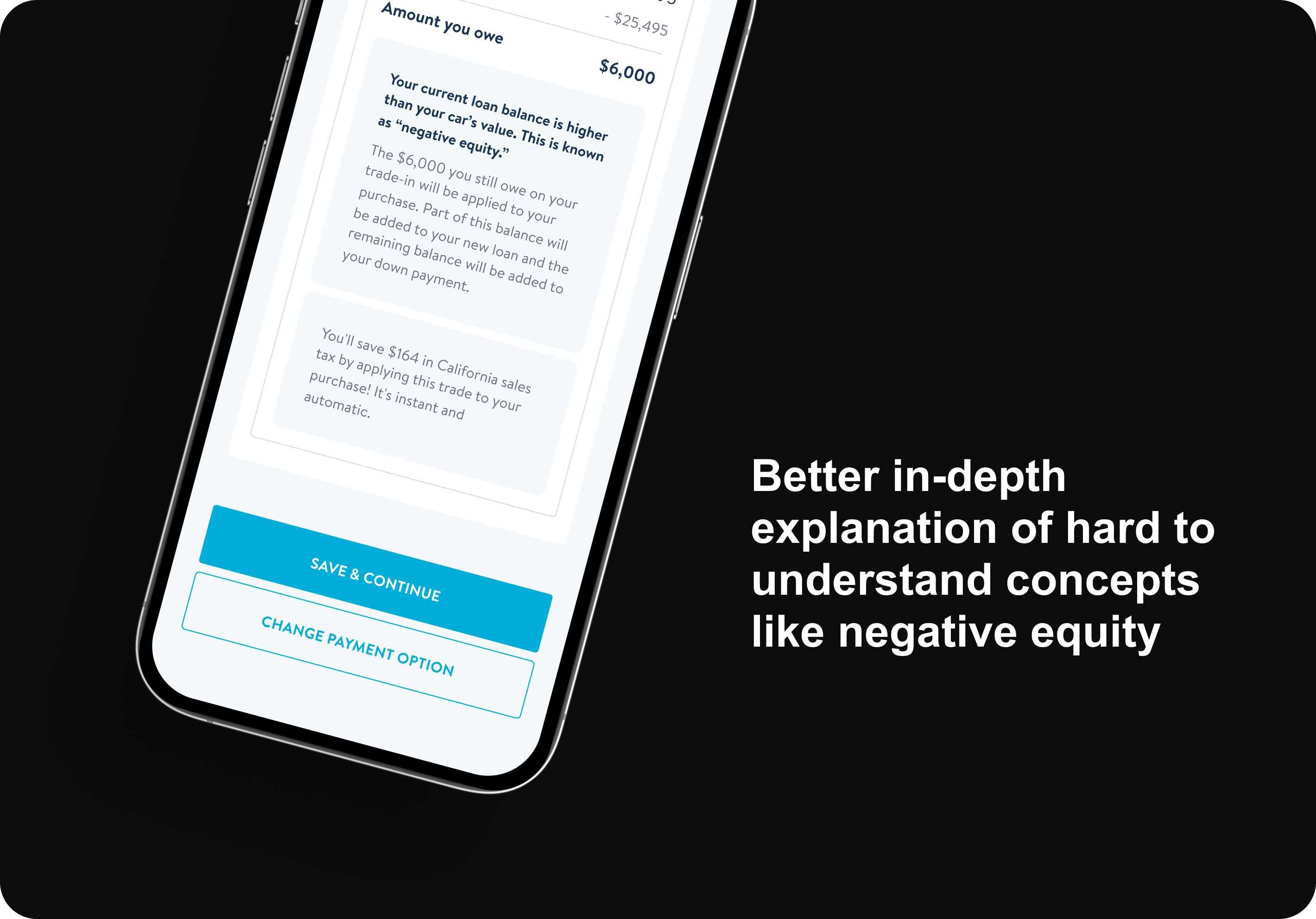
The second key change was highlighting the application of trade-in value without fully explaining its impact. This left users uncertain about whether their trade-in would increase or decrease their down payment, as not all trade-ins necessarily improve financial terms.
Lastly, we used social proof, suggesting users pick one financial option over another. Since finances are personal and often rigid, showing the popularity of one choice may have unintentionally pressured our users, making them feel inadequate if they couldn't afford the same option.
Action
I analyzed the differences between the two versions to understand the problem.
Result
Presenting two sets of financial terms, unclear trade-in value impact, and using social proof caused confusion.
The Journey to Understanding
The audit helped me better understand the differences between the two versions and form a preliminary hypothesis. But I wanted to dig deeper to understand what our users were actually experiencing.
USERS BEHAVIOR
Firstly, I reached out to our data analyst to get a grasp on our current data and what it could possibly mean. Our data dashboard indicated a lower conversion rate (~2% less), suggesting users were churning at the new Financing page, as this was the only live experiment in that segment during that time period.
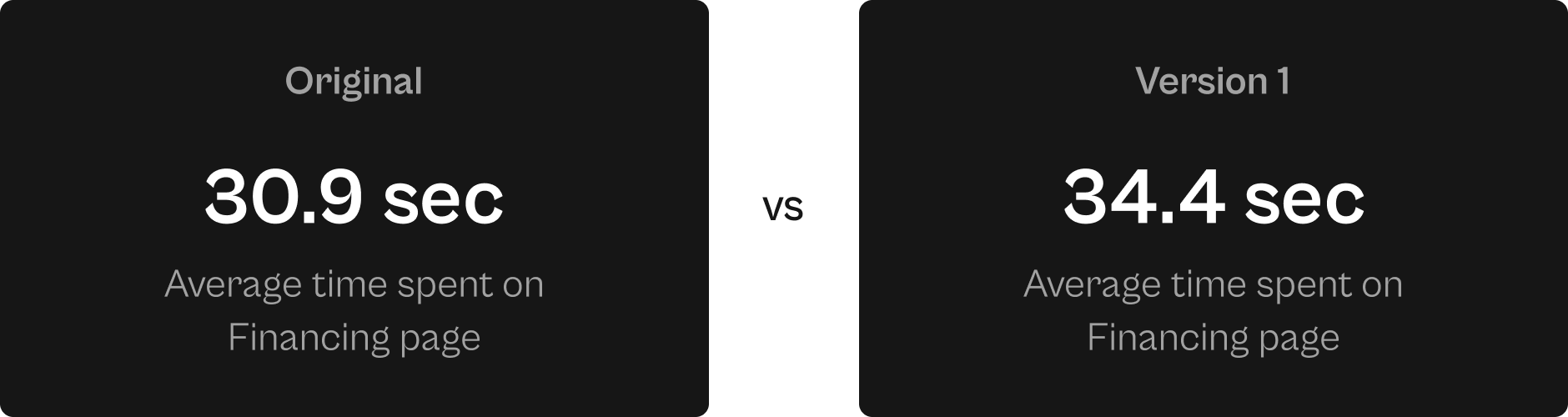
The data was a helpful start but it didn’t answer the why or how. So I watched Fullstory sessions and interestingly, I found that users spent more time contemplating their terms in Version 1 design than the legacy design.
This could be a result of the additional set of terms which now forces users to analyze and determine the best option for their situation.
USERS ATTITUDE
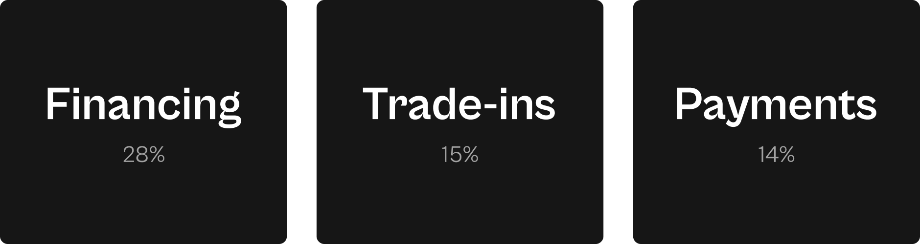
During the project, I found out that our Customer Experience team was analyzing support tickets and had discovered that over half of the tickets were questions about financing (28%), trade-ins (15%), and payments (14%).
This was concerning, as these are key areas that can hinder conversions. From my review of the detailed CX reports, it was clear that users were mostly confused about their high down payments, the impact of trade-ins on their financing, and other nuanced questions related to terms.
We thought we had mitigated these confusions with the redesign but it seems like we still had room for improvement.
Action
I reached out to our data analyst and Customer Experience (CX) team and discovered a 2% lower conversion rate on the new Financing page.
Result
I saw users spending more time on Version 1, likely due to added terms. Our CX team noticed many support tickets about financing, trade-ins, and payments, showing ongoing confusion after the redesign.
After synthesizing all the findings, I arrived at the following hypothesis
The redesigned Financing page created complexity by introducing two options and didn't effectively clarify terms and trade-in details for users.
Choosing the Right Path in a Sea of Possibilities
While exploring various solutions, I stayed focused on my initial hypothesis to ensure I’m designing relevantly. After exploring a breadth of ideas, I delved deeper into the one direction I felt most confident in. From there, I played out all the possible states and flows to ensure the solution is airtight and is compatible with our holistic checkout flow and the larger ecosystem. Here are some solutions that I explored.
Unveiling the Final Design
ISSUE 1: COMPLEXITY OF TERMS
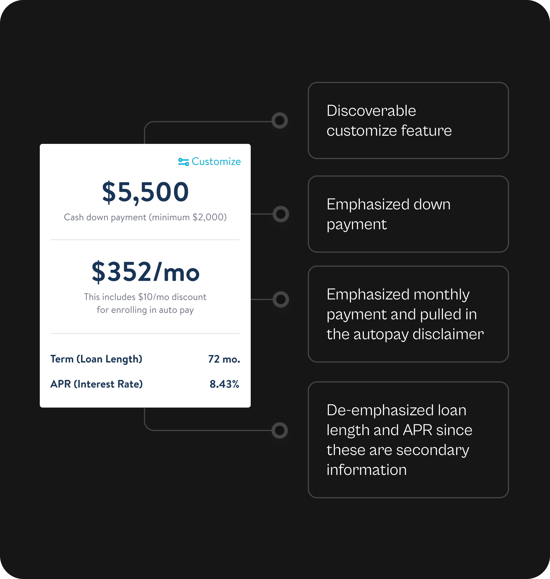
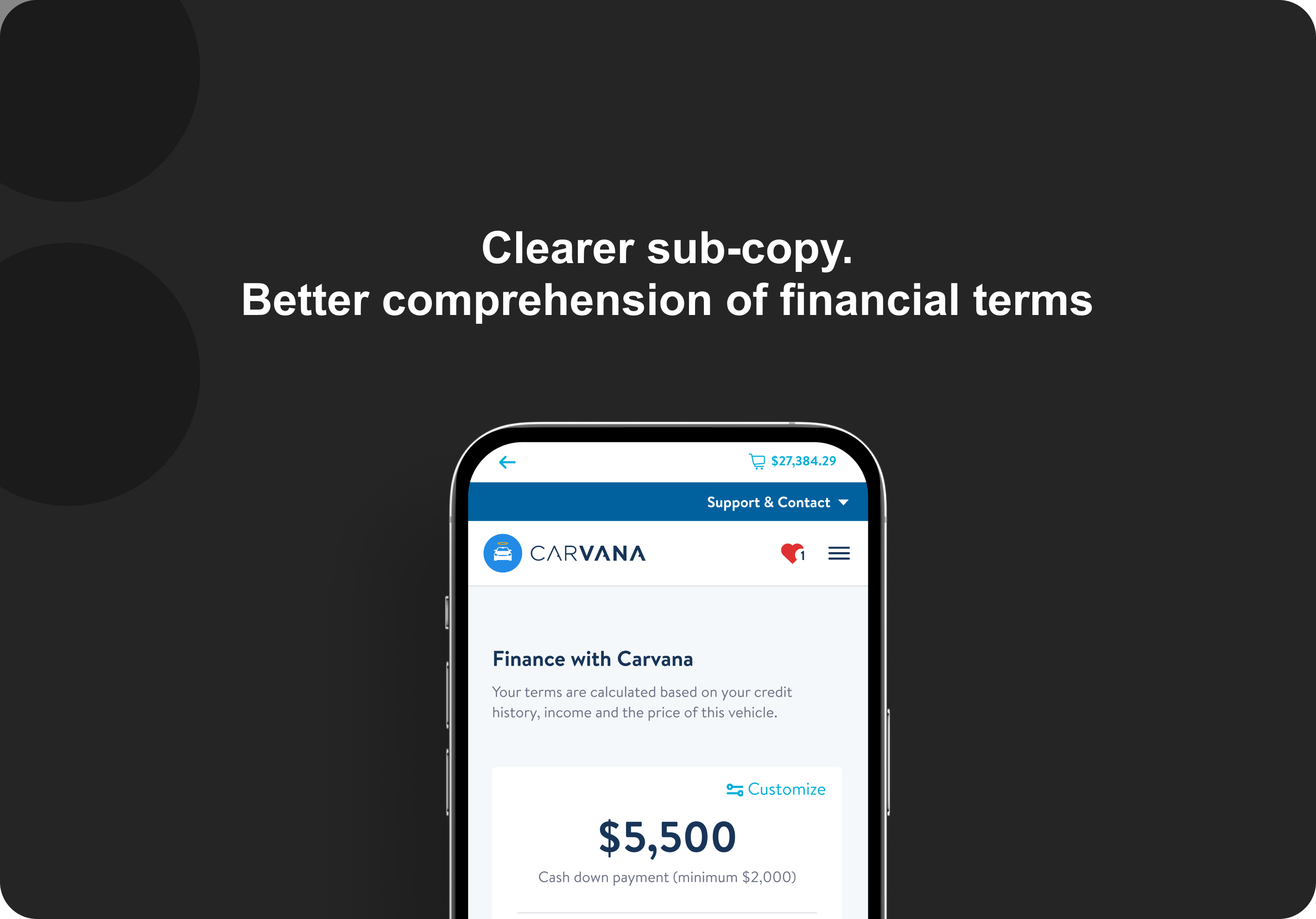
I aimed to simplify the decision-making process by offering just one set of terms. And to cater to those financially savvy users, I made the customization feature more discoverable.
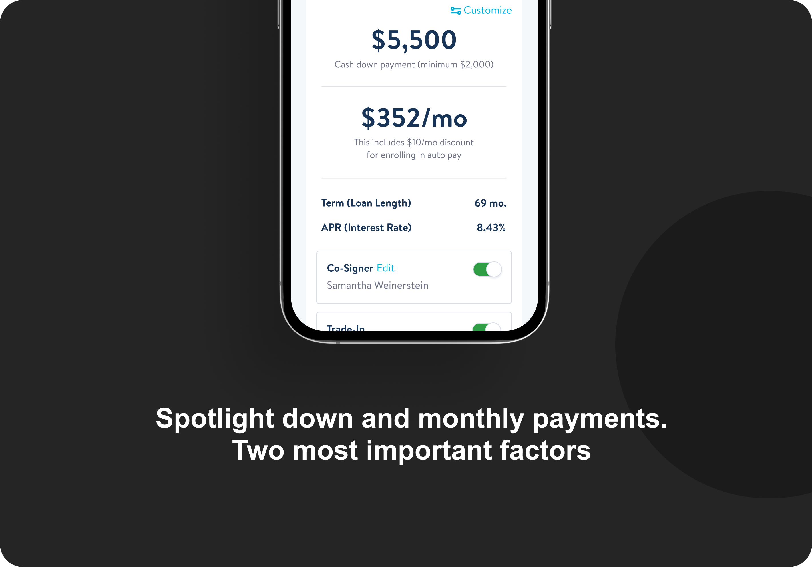
Recognizing our users' sensitivity to down payment and monthly payments, I adjusted our information hierarchy to emphasize these elements more prominently. This would make it easier for users to assess if the terms suited their situation.
Additionally, we wanted to highlight the benefit of saving $10 per month by opting into autopay. Placing this information closer to the monthly payment details made it easier to draw the connection.
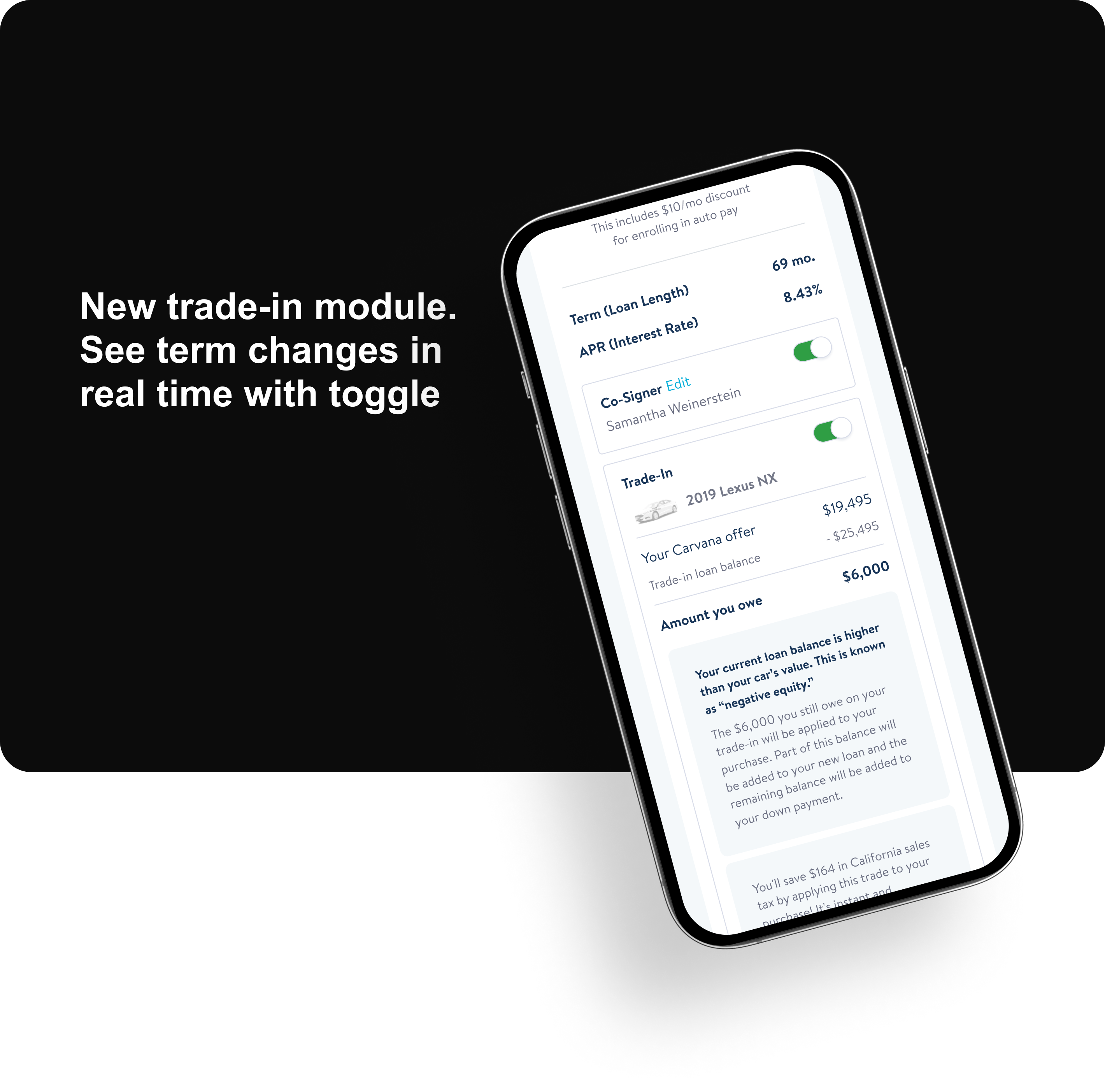
ISSUE 2: CONFUSION AROUND TRADE-IN
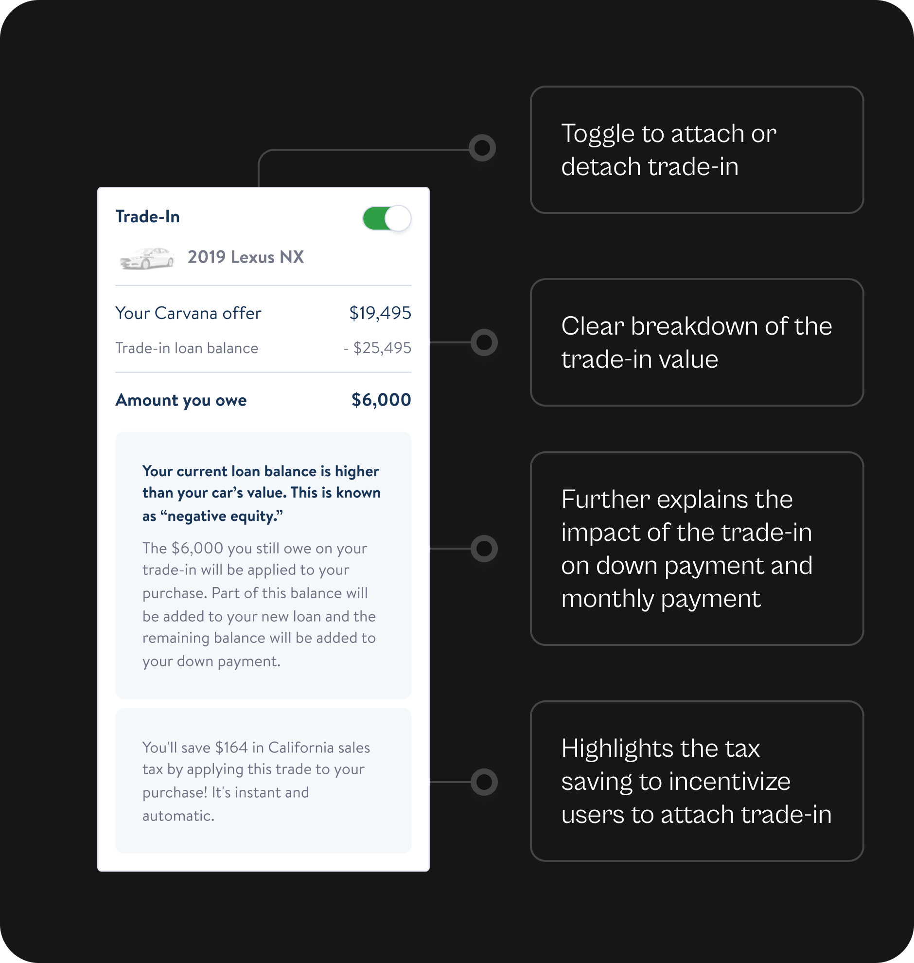
Our customer experience reports showed that users were mostly confused by financial terms and trade-ins.
To make things simpler, I clarified the down payment details, specifying that users could add to the minimum amount but not decrease it. This helped them understand how they could customize their payments and where the limitation is.
I also improved how we communicated the effect of trade-ins on down payments. A new section was added to explain this clearly. It allowed users to easily adjust their trade-in within the financing page, making the process more straightforward than before.
Design Changes
1. I simplified terms, improved customization, and highlighted savings with autopay.
2. I clarified trade-in rules and made adjustments easier in the financing page.
INTRODUCING
The New Financing Page
The Impacts of The Redesign
USERS BEHAVIOR
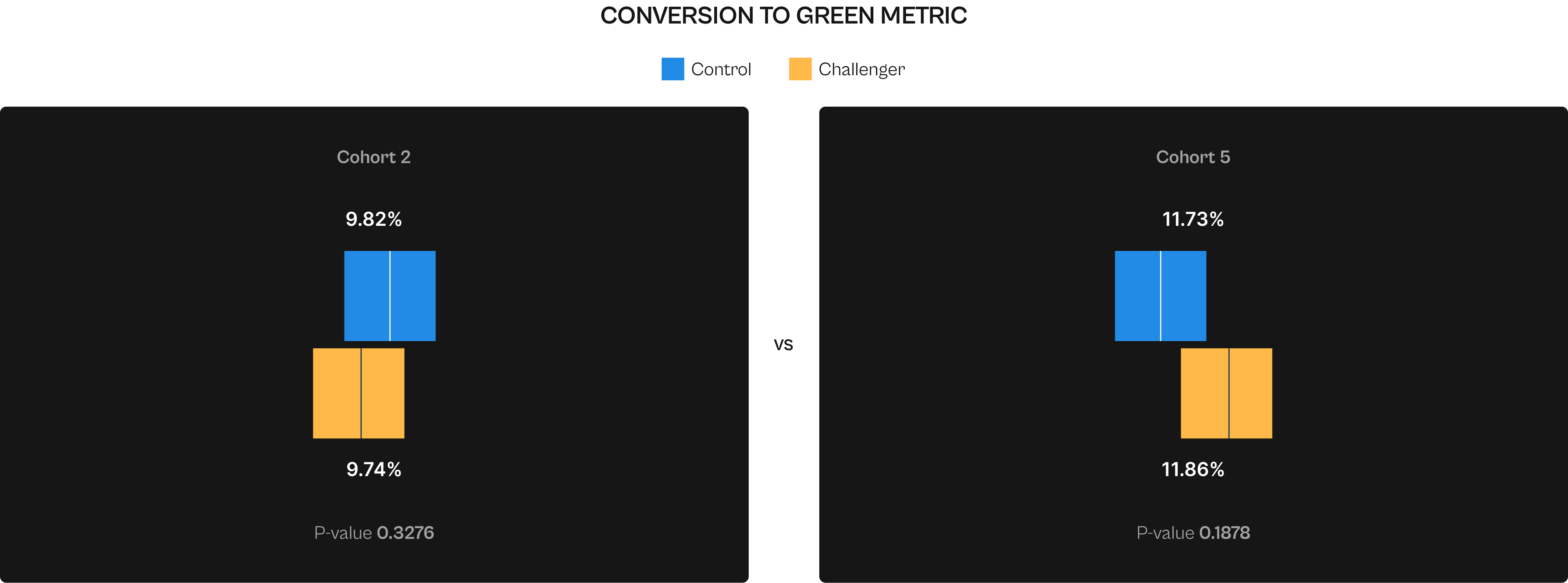
After launching the redesigned Financing page, we tracked the "Conversion to Green" metric, a more immediate indicator of purchasing intent than "Conversion to Sale." This metric offered quicker feedback, with insights available in just 5 days instead of 25. After a few weeks and over five cohorts, we observed an increase in this conversion rate, from -1.3% to +1.1%. Although this didn't completely match the original design's performance, it was an improvement over Version 1.
USERS ATTITUDE
To further evaluate the impact on user experience, I collaborated with the Customer Experience team for another round of analysis. The results showed a promising reduction in finance and trade-in related queries by 4% and 2%, respectively, suggesting our redesign was effective in reducing user confusion. However, this redesign is just a step in the ongoing process. We plan to keep monitoring and introduce new updates and features to further improve user understanding and satisfaction.
Action
I tracked our experiment dashboard and reached out to the Customer Experience team to retrieve data.
Result
"Conversion to Green," showed an improved conversion rate from -1.3% to +1.1% and we saw 4% decrease in finance-related queries and a 2% decrease in trade-in queries.
Reflecting on This Journey
Business and technical limitations are common in projects, and I make it a point to thoroughly understand these challenges and discuss them with my stakeholders.
In this case, I had to compromise on the ideal design due to system limitations and a tight timeline. My product partners’ approach often involves launching ideas quickly, which can sometimes be at the expense of a better user experience. While this makes sense from a business standpoint, I believe there's always some room for negotiation.
I should advocate for the best possible solution, and if that's not immediately achievable, to persistently work towards it until we reach our goal.
OTHER PROJECTS
Carvana
FabFitFun - Preview Customization
Los Angeles Times -
FabFitFun - Preview Customization
Selected Works
LAT AppProject type
Enpower LA - 311 DataProject type

DINNEProject type
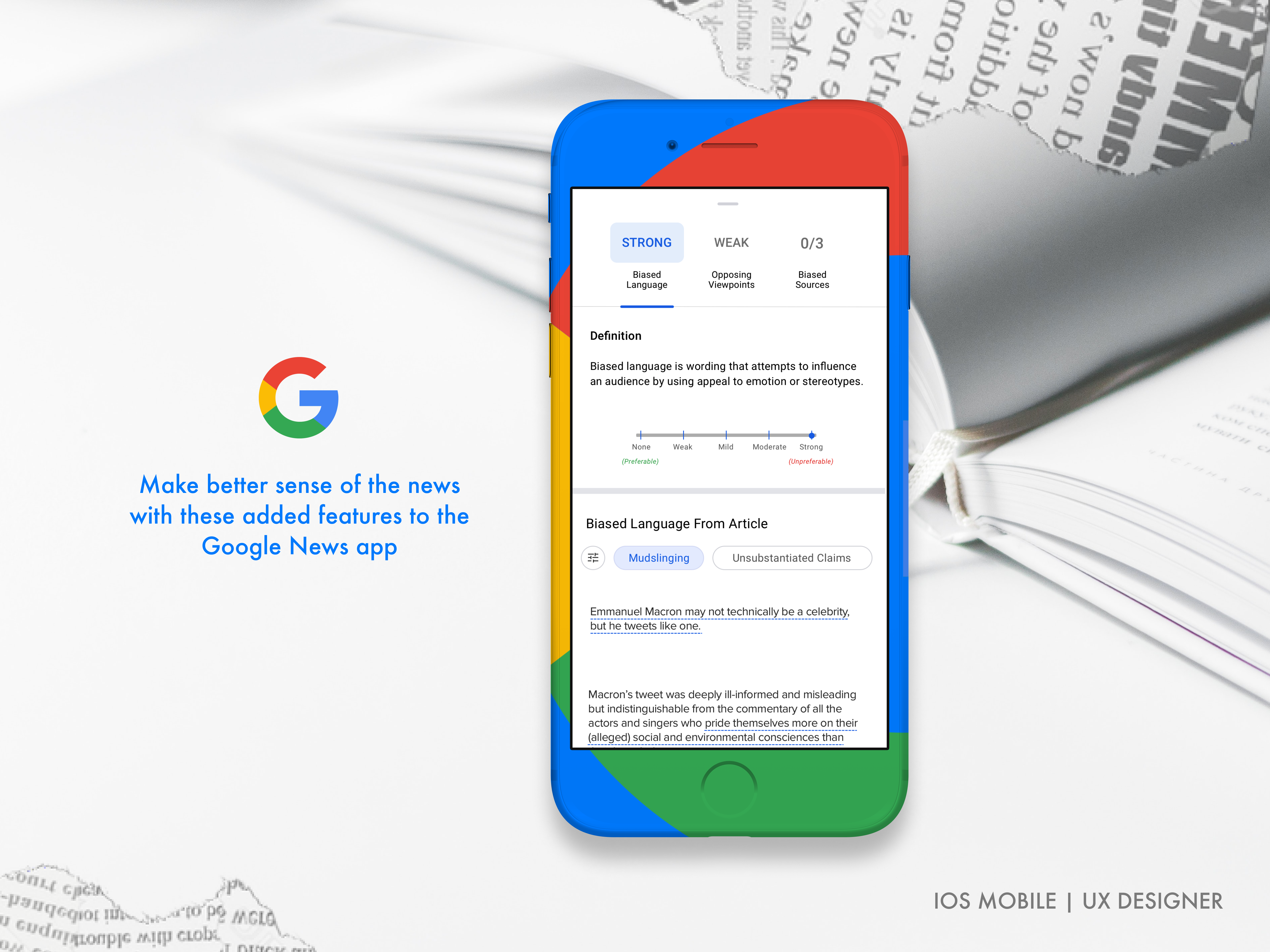
Google News DigestedProject type
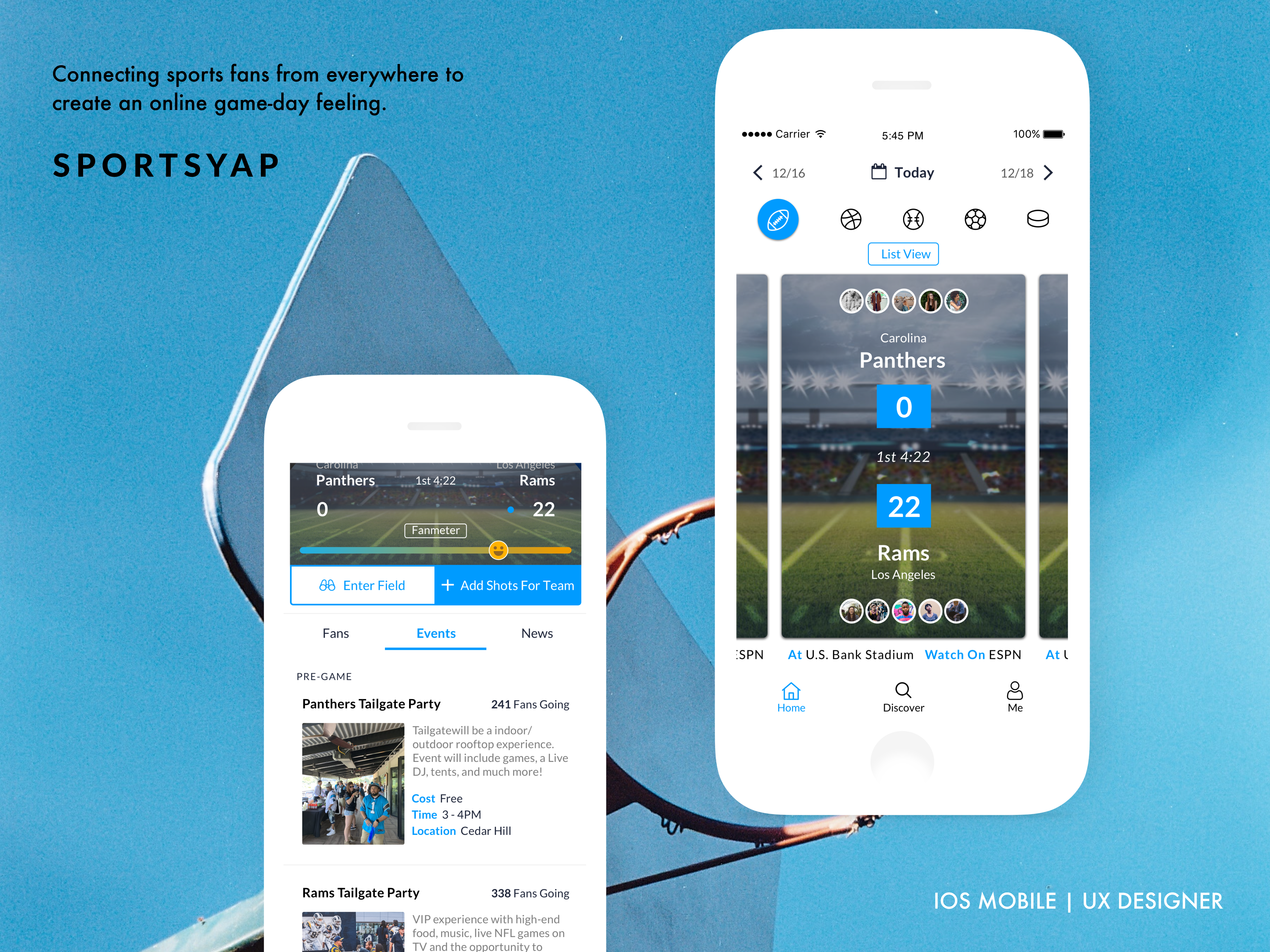
SportsyapClient Work